TL;DR
10q10k.net is a financial data platform covering all S&P 500 companies. It visualizes quarterly earnings as interactive Sankey flow charts — showing how revenue flows through costs, profits, and expenses. The entire stack runs on Cloudflare's edge with zero traditional servers.
What It Looks Like
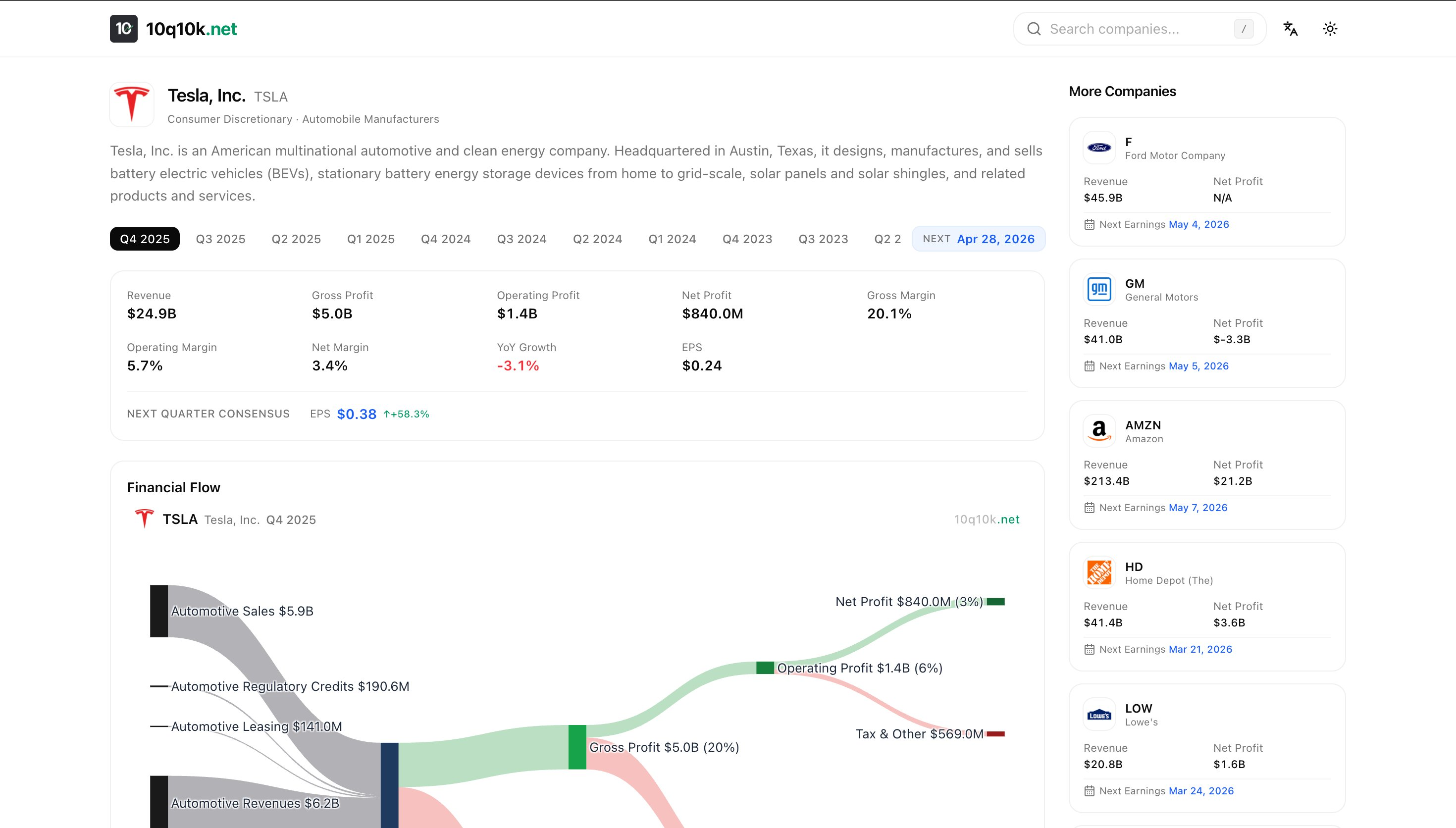
Every company page shows:
- A Sankey flow chart mapping revenue segments → gross profit → operating profit → net profit
- Financial metrics with YoY growth, margins, and EPS beat/miss indicators
- Income Statement, Balance Sheet, and Cash Flow breakdowns with bar charts
- Earnings calendar with upcoming report dates
The charts are downloadable and copyable — hover to see action buttons. The exported PNG includes company branding and a watermark, composited via Canvas API.
Try it: NVDA · AAPL · GOOG · MSFT
Architecture
pnpm monorepo
├── web/        # Next.js 16 (App Router) — frontend
├── worker/     # Cloudflare Worker — data pipeline
└── share/      # Shared TypeScript types & constants
Everything runs on Cloudflare:
- Workers for server-side compute
- D1 (edge SQLite) for storage
- Pages for static assets
No EC2, no RDS, no Docker. Monthly cost is near-zero on the free tier.
Technical Challenges
1. Financial Data Is Messier Than You Think
The same metric — "Revenue" — can be reported under 15+ different names depending on the industry:
// Standard companies
"RevenueFromContractWithCustomerExcludingAssessedTax"
// Banks
"InterestAndNoninterestRevenue"
// Utilities
"ElectricUtilityRevenue"
// REITs
"RealEstateRevenueNet"
// Oil & Gas
"OilAndGasRevenue"
And some companies don't report an explicit revenue concept at all. For those, we fall back to a computed value: OperatingIncome + CostsAndExpenses. This single decision unlocked ~40 more companies.
Lesson: If you're working with financial data at scale, budget 80% of your time for edge cases and normalization.
2. The Fiscal Year Mapping Problem
Not every company's fiscal year matches the calendar. Apple's Q1 ends in December. Microsoft's ends in September. Walmart's fiscal year starts in February.
I built a quarter mapping system that normalizes all companies to calendar quarters, handling:
- Non-standard fiscal year starts
- 52-week fiscal years (period ending Dec 28 vs Jan 1)
- A 7-day grace period at quarter boundaries
3. Quarterly Cash Flow from Cumulative Data
Most companies report year-to-date cumulative cash flows, not quarterly values. A Q3 filing shows 9 months of data, not 3.
To derive a single quarter:
Q1 = Q1 YTD (as reported)
Q2 = H1 YTD − Q1 YTD
Q3 = 9M YTD − H1 YTD
Q4 = Annual − 9M YTD
The challenge is identifying the correct prior period to subtract. The algorithm matches entries by fiscal year start date and selects the longest preceding period — critical for Q3 where you need the 6-month entry, not 3-month.
4. Revenue Segment Extraction
Breaking down revenue by business segment (e.g., Google Services vs Google Cloud) requires parsing structured tags embedded in financial filings. The pipeline:
- Parse context elements (period dates, dimensional axes)
- Match financial values to their contexts
- Score axes by revenue coverage — prefer axes where named segments cover ≥40% of total revenue
- Handle Q4 specially: derive from annual minus Q1+Q2+Q3
5. The "Octopus" Sankey Layout
Standard Sankey charts become chaotic with 10+ nodes. I implemented a custom "octopus" layout:
- Center: Revenue node as the body
- Left tentacles: Revenue segments, spread proportionally by value
- Right flows: Cost of Revenue → Gross Profit → Operating Expenses → Net Profit
Key layout decisions:
- Value-weighted Y positioning — larger segments get proportionally more space
- Flow conservation — outflows never exceed inflows
- Loss handling — companies with negative profits render red flows correctly
- Coverage threshold — only show segments if they cover ≥40% of revenue
I used Plotly.js with arrangement: "fixed" and manually computed node coordinates. The default "snap" mode creates visual chaos at this scale.
Chart Export Without html2canvas
I initially used html2canvas for PNG export, but it crashed with:
Error: Attempting to parse an unsupported color function "lab"
Modern CSS uses lab(), oklch(), etc. that html2canvas can't handle.
The fix: Use Plotly's native toImage() to export just the chart, then composite branding via Canvas API:
// 1. Export chart as PNG from Plotly
const dataUrl = await Plotly.toImage(chartEl, { format: "png", scale: 2 });

// 2. Create a larger canvas with header/footer space
const canvas = document.createElement("canvas");
const ctx = canvas.getContext("2d");

// 3. Draw background → header (logo, symbol, quarter) → chart → watermark
ctx.drawImage(chartImg, 0, headerHeight);

// 4. Export final composite
canvas.toBlob(resolve, "image/png");
This gives full control over the exported image — branding, background color (dark/light theme aware), and 2x resolution — without any DOM screenshot library.
Frontend Stack
Next.js 16 on Cloudflare Workers
Server components fetch from D1 at the edge. No API round-trips, minimal latency worldwide.
Deployed via @opennextjs/cloudflare — the OpenNext adapter that makes Next.js App Router work natively on Cloudflare.
Three-Language i18n
Full English, Chinese, and Japanese support via next-intl. English URLs omit the locale prefix (/AAPL), while others are prefixed (/zh/AAPL, /ja/AAPL).
SEO-First Design
Every company page generates:
- Dynamic
<title>and<meta description>targeting analyst search queries - JSON-LD structured data (Corporation + Dataset schemas)
- Open Graph and Twitter Card meta tags
- A comprehensive sitemap covering all companies × locales
- Canonical URLs with
hreflangalternates
Mobile Optimizations
- Bar charts:
staticPlot: trueon mobile to prevent accidental zoom while scrolling - Sankey charts: Horizontal scroll wrapper for small screens
- Responsive layouts: Two-column grid on desktop, stacked on mobile
What I Learned
Financial data normalization is the real challenge. Fetching data is easy; making it consistent across 500+ companies with different reporting standards is where you spend all your time.
Cloudflare's edge stack is production-ready. D1 + Workers + Pages can power a real data platform. Zero DevOps, near-zero cost.
Plotly.js Sankey charts need manual layout. The automatic positioning creates chaos with many nodes. Fixed coordinates with value-weighted positioning is the way to go.
Don't use
html2canvasin 2026. Modern CSS color functions (lab,oklch) break it. Use native chart library export + Canvas API compositing instead.YTD cumulative reporting is an underappreciated complexity. If you're building anything with quarterly financial data, you will need subtraction logic for cash flows.
Try It
Explore any S&P 500 company's financial flow — the Sankey charts are interactive, downloadable, and available in three languages.
Built with Next.js, Cloudflare Workers, D1, Plotly.js, and TypeScript.